
PHPStorm: "Submit & Cancel" buttons look the same
complete
P
Paul
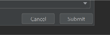
The "submit" and "cancel" buttons look the same and are inconsistently ordered compared to the rest of the UI, which has caused me to click "cancel" instead of "submit". There is also no feedback on cancelling, so I thought I had successfully submitted. Other PHPStorm integrations use a highlighted style for the primary CTA which makes it easy to see which one to click.


Nick Omeyer
complete
Hey Paul, we've just released an update to the plugin with a new reporting modal that uses the right kinds of buttons! Thanks for raising this 🙏
Nick Omeyer
in progress
Nick Omeyer
planned
Thanks for flagging this & the screenshots 🙏 We'll take care of it next week.
P
Paul
Screenshots:
- Git Plugin "create Gist" dialog
- Stepsize (note the spacing around the edge, too)
- Main PHPStorm settings dialog